Just a little back story: Stanton Wigglesworth LIV prefers the name Wiggles to Stanton. LIV means 54 in roman numerals. He's the 54th S. Wigglesworth in his family. He has an older brother named Stephan Wigglesworth LIII. Wiggles is a travelling Librarian (Stine and Frank are his horses that pull his library). He's the only one who knows that Lettice (the bunny) can talk, which is quite unfortunate because Lettice never stops talking. His brother runs the rival library. Mary Lovely (daughter of the ruler of the city) loves books and libraries but despite Wiggles' attempts, she doesn't know of the Library On Wheels. So she donates a lot of money to Stephan's library.
Wiggles' DESIRE (oohhhh) is to get into the high society crowd. He's well on his way with a top hat and monocle but he needs a cane to be complete. And he just can't find the perfect one. His DETERRENT (aahhhh) is that it's hard to make money from a Library On Wheels.
And from a design point of view: Warm colours = working class, cool colours = high society.
Wiggles:

Lettice:

Mary:

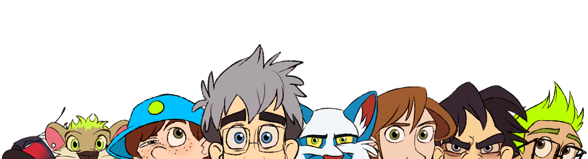
Lineup:

Noooo I know we didn't have to do a lineup but I wanted to see how the other characters would fit together with the 3 main characters.
6 comments:
Great Designs...great concepts..and that you decided to use different range of colors to show differences between classes is amazing. Thumbs up!!
About the over all designs, there's something that would improve them...I think a bit more of solid structure would give them more three-dimesionality. I feel that when you design you begin with a flat concept and then you add the structure, maybe I'm wrong. But if I'm right try to build the basic structure first as if you had to explain to somebody how to animate it(joints, proportion, volumes...etc). Then add the details and the final shapes. Just my meek suggestion :)
I love wiggles but If I had to animate it, the chain's monocles would be painful...better a line than just dots floating on the air. I would add a chain watch on his vest...a big one, that you can't understand how it can fit on a pocket so small. I would also fold one of the shirt's sleeve a little, ,make it more baggy or add an armband (those old armband that were used for keep your baggy sleeves out of the ink pad)...that would give it a sort of an asymmetric aspect, and also a librarian needs his hands to work. :) For the color I would make the shirt more whitish...it seems to me too much homogeneously colored, I need some light. The cane concept will add a lot of good moments to your story. Good idea!
Great lettice...great facial expression.
Mary is good...I'd probably add a book on her hand...with a ribbon attached to a fancy bookmark, something that moves on the air when she walks and grabs wiggles attention.Maybe a tiny chain belt? Not sure. What I said before about structure is more noticeable on her hand.
My favorite of all...Stephan..jeje.
As always...you make me want to be a better artist.
Great job Chelsea!!
Ohh man!! I wrote an essay!!
hey Chelsea, yeah, although I don't agree with Juan's method of developing characters (no offense Juan) I do agree with his design suggestions. I think the hands for the human characters can be just a little more developed BUT I do like the direction the contrast between Wiggles and Stephan's hands. I don't know if you just drew it fast but Mary's fingers seem a little too long...like, if your going for delicacy I'd make them itty bitty and cute....BUT NOT CHUBBY!!! That's for Wiggles which is why his fingers are so cute.
And also, I think this is a subjective thing but something about Stine...and his neck...it looks medium sized to me and I think it would benefit if it was stretched longer or reduced shorter or something, I don't know. Maybe I need to see him in more poses but either way, don;t get caught up in too much subjective criticism, do what feels right.
Mary needs a set of boobs. thats all i have to say, take it or leave it!
aaaa, you guys are so great. I would have never thought of these myself, thank you! <333 And alright, I shall add some boobs. x)
A note on the flatness though, I did want to keep them in a bit of a Flash-like design (kinda Foster's style?). Even to the point where they would still work even if they had little to no outline. d: So... yeah, I dunno, haha.
Yeah, first I thought it was more kind a Flash designs, but as I dislike Flash...you know.
...And well...I should've ask Courtney when I thought mary needed "something that moves on the air when she walks and grabs wiggles attention."...A bookmark!? Man...I need to grow up!:D
Post a Comment